By The Teel Team
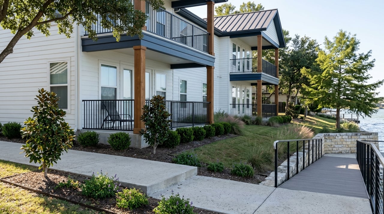
Paint color is one of the highest-impact, lowest-cost changes you can make to a home — and one of the easiest to get wrong. Whether you're refreshing a Richland Chambers Lake property before listing or finally committing to a palette you've been thinking about, here's how to approach it.
Key Takeaways
-
Start with fixed finishes (flooring, countertops, cabinetry) before choosing wall color
-
Natural light shifts dramatically throughout the day and changes how colors read on your walls
-
In 2026, warm whites, earthy neutrals, and muted greens are the dominant interior palette
-
Always test colors on the actual wall before committing
Start With What You Can't Change
The most common color mistake is choosing wall paint first and trying to match everything to it afterward. Paint should respond to your fixed elements (flooring, countertops, cabinetry, tile), not the other way around. Those are expensive to change; paint isn't.
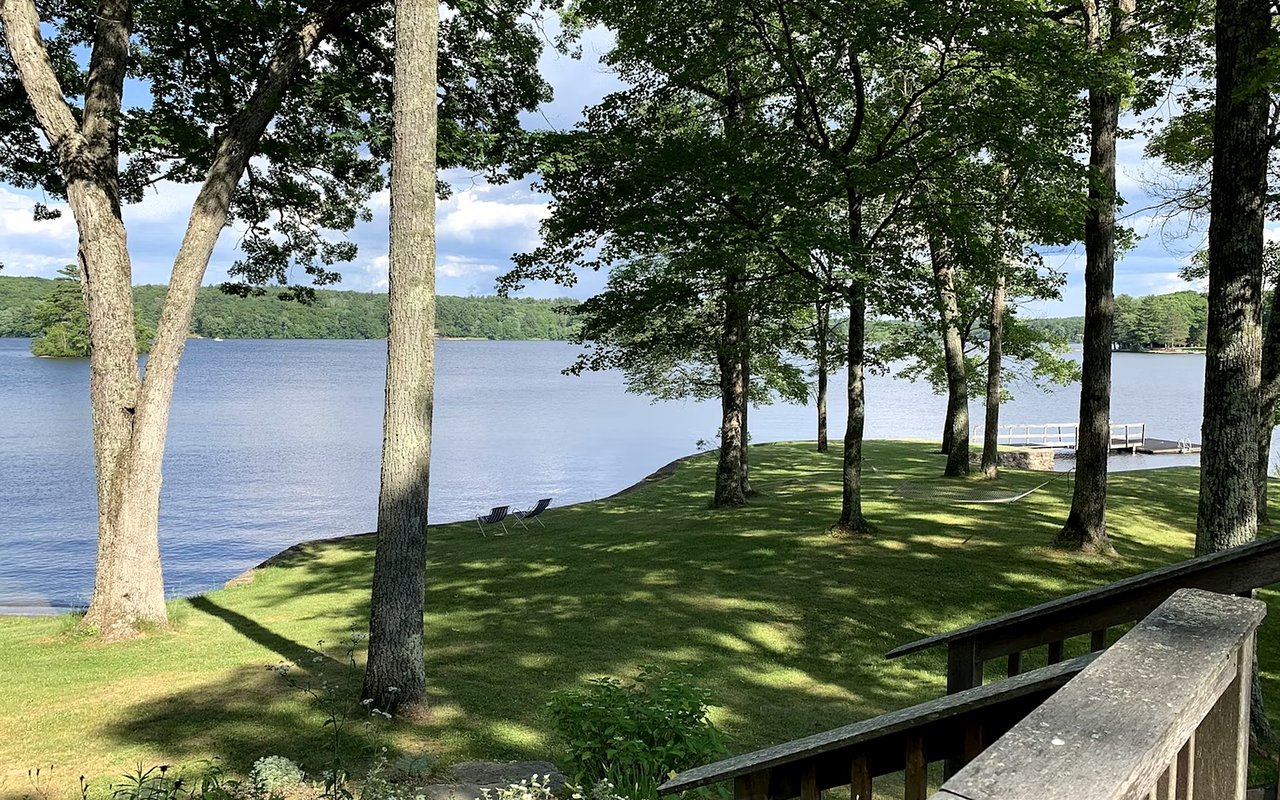
In a lake home, that typically means warm wood tones, stone, and natural textures that pair best with earthy, grounded hues. Cool grays tend to fight with warm wood and water-reflected light.
In a lake home, that typically means warm wood tones, stone, and natural textures that pair best with earthy, grounded hues. Cool grays tend to fight with warm wood and water-reflected light.
How to Read Your Fixed Finishes
-
Pull undertones from flooring and cabinetry first; warm wood pairs with warm whites, taupes, and soft greens, not cool grays
-
Stone and tile often have a dominant undertone that should guide your wall color family
-
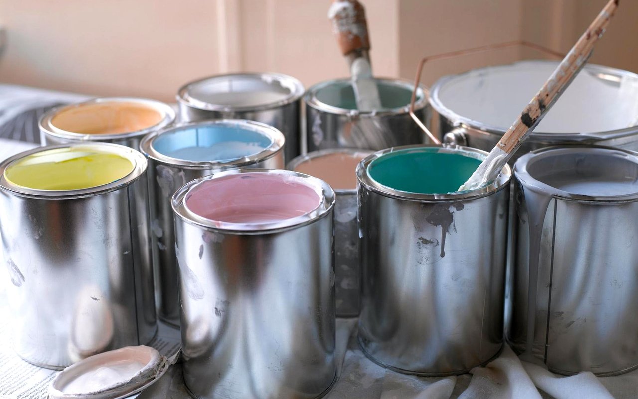
Choose paint chips that draw from colors already present in the room rather than starting from scratch
Understand How Light Changes Color
The same color can look completely different at 8 am versus after sunset, and in a lake home where light shifts constantly, that matters. Water-reflected light has a cool, luminous quality that can make warm tones feel vibrant and cool tones feel icy.
Always observe a paint swatch at multiple times of day before committing. What looks like a soft sage in the morning can read nearly gray by evening.
Always observe a paint swatch at multiple times of day before committing. What looks like a soft sage in the morning can read nearly gray by evening.
How to Evaluate Color in Your Space
-
Paint a large swatch directly on the wall; not a chip or piece of cardboard
-
Check it in morning light, afternoon light, and under your evening artificial lighting
-
North-facing rooms get cooler, consistent light; lean warmer to compensate
-
South and west-facing rooms get strong afternoon sun; lighter values prevent colors from reading too intense
Room-by-Room Guidance
In 2026, the interior design direction has moved away from stark white and cool gray toward warmer, more grounded tones: soft warm whites, creamy beiges, muted sages, and earthy clay. At Richland Chambers Lake, those tones work naturally because they echo the landscape outside the windows.
What Works Room by Room
-
Living areas: warm whites and soft greiges create a flexible, photogenic base; navy or deep green works well as an accent wall in a lake-facing great room
-
Bedrooms: muted, cooler tones (soft blue-gray, pale sage, warm linen) support rest and feel calm at any hour
-
Kitchens: warm whites and creams are replacing stark white; a soft mushroom or taupe on an island reads current without dating quickly
-
Bathrooms: carry one grounded color across walls and ceiling for a spa-like feel; avoid high contrast in small spaces
Build a Whole-Home Palette
Using a different color in every room without a connecting thread makes a home feel choppy. The goal is making sure colors share an undertone family so the home flows naturally from room to room.
How to Create Cohesion
-
Choose a base neutral for hallways and transitional spaces first
-
Select room colors from the same undertone family as that base; all warm, all cool, or a deliberate shift from public to private spaces
-
Keep trim and ceiling color consistent throughout to unify everything
FAQs
What colors hold up best for resale at Richland Chambers Lake?
Warm neutrals (soft whites, greiges, and earthy tones) consistently outperform bold or highly personal choices with buyers. They're broadly appealing and photograph well, both of which matter when it's time to list.
A color looks great online, but wrong on our walls — what happened?
Screens distort undertones significantly. A color that reads gray online often pulls green or purple on a wall. Large swatches tested in your actual lighting are the only reliable way to confirm a color before buying a full gallon.
Should lake-view rooms be painted differently than interior rooms?
Often yes. Rooms with strong natural light and water views can handle slightly cooler or more saturated tones. Interior rooms with less light benefit from warmer, lighter values to keep them from feeling closed off.
Work With The Teel Team Today
Whether you're refreshing your lake home before putting it on the market or making it feel more like home after a recent purchase, we're here to help. We've worked with buyers and sellers throughout Richland Chambers Lake and know firsthand what makes a property show well and sell well.
When you're ready to talk real estate, reach out to us at The Teel Team. We'd love to help.
When you're ready to talk real estate, reach out to us at The Teel Team. We'd love to help.